Blog: Amazon Product Listings Best Practices: The Good, The Bad, The Ugly
Amazon Product Listings Best Practices: The Good, The Bad, The Ugly
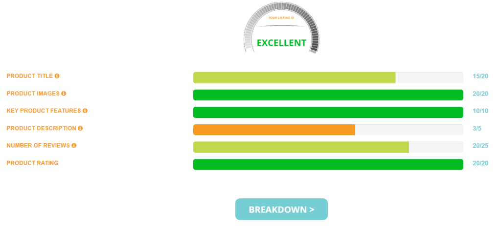
A few weeks ago we quietly released a new feature that is going to help you improve your Amazon product listing. It is called the Product Listing Grader, and it is beautifully simple: enter the ASIN or Amazon URL of a product, and get the breakdown of the listing’s quality on a simple 0-100 scale.
Once you enter an ASIN, you'll get an overview, like below, with some actionable steps to improve each aspect of your listing:
We started quantifying the quality of a listing months ago when we added the Listing Quality Score to the Web App. It became a very popular feature to help identify products that have good sales despite a poor listing. Imagine if you had a better product and a better listing? You could easily exceed that listing in the organic rankings in a short amount of time.
People love seeing a how different listings compare to each other, and where improvements can be made. In this post, I want thought it would be fun to take some listings of potentially good Private Label products and share my thoughts on the listing quality.
I found these products by using the Web App, with the following criteria:
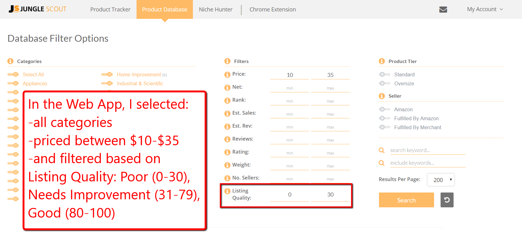
By the way, do you like the cleaned up user interface of the Web App? A little face-lift never hurt anyone 😉
So I have just cherry-picked a few of the results that we can review together and see what is good, bad, what should be emulated, and what should be avoided. I don't mean to pick on anything here, just use these as instructive examples that we can all learn from.
The two products that we will review today are:
The Product Title
The Product Title is helpful for potential customers, and the Amazon algorithm, to know what your product is in just a quick glance.
I have seen an ongoing debate online how many keywords and characters is optimal for including in the Product Title. Amazon will allow up to 250 characters, so my philosophy is that you should use as much of that real estate as possible!
This is what the Jungle Stix listing looks like. You can see that we focused on including our main keywords, as well as some additional keywords that converted into sales (which we confirmed by looking through our Pay Per Click keyword data):
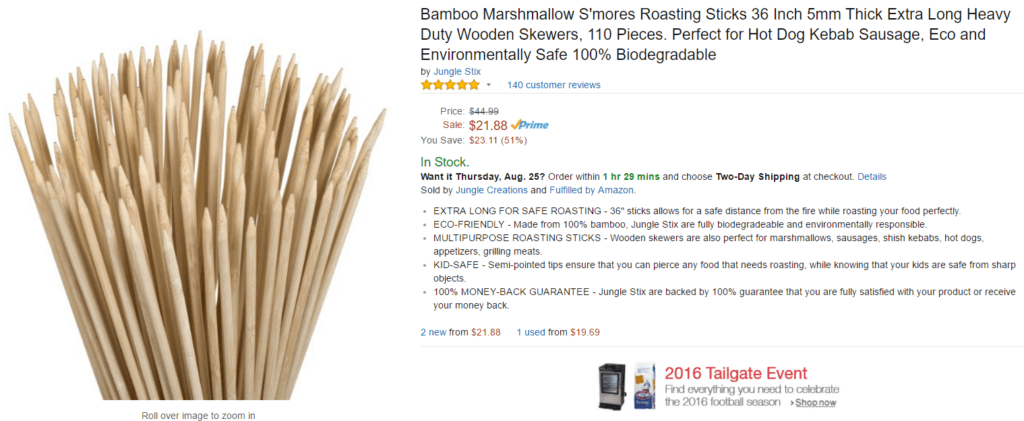
When creating this listing, we were targeting “bamboo marshmallow roasting sticks” and variations of that. That is why you see those keywords at the front of the listing. You generally want to place your most important keywords at the front of the listing. And that strategy worked well for us, where we were able to grab the top organic spots for those keywords in less than 2 months.
Now let’s take a look at a few examples of how these listings did their product titles. This is the main feature text of the Ankle Cuff, which has a Listing Quality Score (LQS) of 8 out of 100. Just to be clear, that score is no bueno.
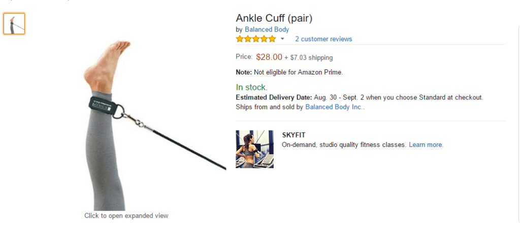
So why is Product Title so poor? Well, the three words in the title are probably enough to tell you that whoever put this listing together was eager to move on to other tasks. Then leave the burden of figuring out the product to the potential customer, and there are enough competing products on Amazon that the consumer can easily just move on to the following SKU.
So what information is missing?
This seller could discuss some of the product’s benefits: increased efficiency in calf, leg, ab, glute exercises, for men, women, weight lifters, high performance athletes, runners, and more.
This seller could address product features, even simple elements like the material, the color, the metal rings or that it is adjustable. Even the ambiguous terms like #1, premium quality, durable, could add some value and some sales sizzle to help convince a visitor to click through.
A Good Product Title:
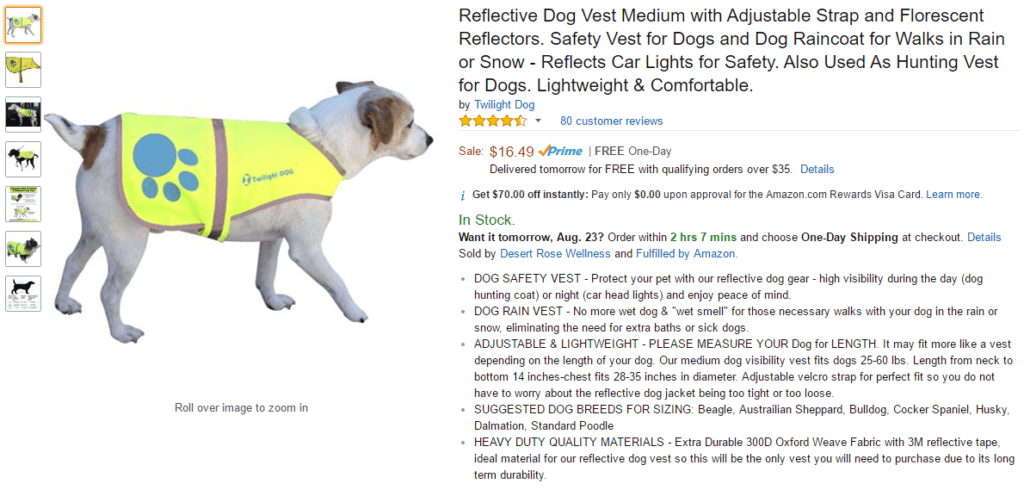
This is a great Product Title! The main keyword is right at the front: “reflective dog vest”. It looks like the seller has made use of all available characters, and address the main product, its main benefit (safety), different use cases (rain, snow, hunting), benefits (lightweight and comfortable), and specifics for this ASIN (medium). I love it!
One thing that could possibly be improved is that the title includes “reflective”, “reflectors’, and “reflects”. Amazon has stated that you only need to mention a keyword once in a listing, and additional uses of the keyword don’t increase the value placed on the keyword. Moreover, as they note in their Terms of Service, keywords are matched to customer search queries using full or partial keyword overlap. Perhaps these variations of “reflect” fall into Amazon’s idea of overlap.
Key Takeaways:
- Prioritize your main keywords at the front of your listing. Address the main product benefits and features in a concise manner. And if there are multiple uses or customer niches for your product, and you can include them in your product title, you may want to do so to increase the likelihood of appearing in those customer search queries.
- Look at Google Keyword Planner, Keywordtool.io, or ubersuggest to get additional relevant keywords. Once you have your main keyword, in this case “ankle cuff”, it is very easy to extend that list to many other related search queries that would attract relevant customers.
- Search on Amazon or eBay with just your main keyword and see what the search results are. Do products that are similar to yours pop up? If so, at least that is a good thing that you are targeting keywords that Amazon sees as relevant to your type of product. And look closer at those listings: what do these listings include that you do not have? This can help you improve your product title to include keywords, product benefits, and product features that your potential customer may be interested in.
For #amazon Product Titles, put main keywords in front. Write for humans, not bots! Click To Tweet
Product Images:
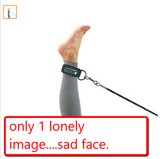
Amazon allows up to 9 images. The ankle cuff only opted for one image. And it is a poor image, at that: less than 1000 pixels on the longest side (so you can not hover-to-zoom with this image), the product is not the focus of this image, and I’m not even sure that this image isn’t upside down!
Amazon recommends that the products fill at least 85% of the image. This clearly does not. Why not take a close-up of the actual product, to give the potential customer a better idea of how it works, the type of material and craftsmanship, and what it looks like from different angles. We can not determine any of this information, which makes me want to just move on to an alternative competitor.
Here is a better example of product images:
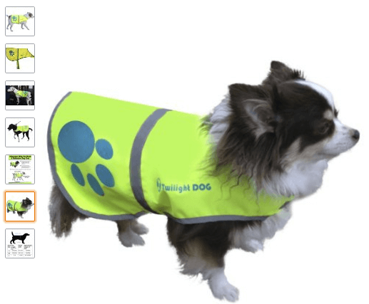
I’ve included a few images in this example, and each has a different purpose. The sellers behind Twilight Dog brand look to be savvy sellers!
I would love to run some split tests on these images, and see which type of dog generates the most clicks, and sessions, as the main feature image. Could it be the most “attractive” dog, or based on the size of the dog, or even the color of the dog (are reflective vests more necessary for black dogs than white dogs)? All hypothetical questions, but something that I would fire up a quick Spiltly test for and get a definitive answer to. We will never know which image will generate us the most sales until we run some split tests on it.
All of these images (except for one) are nicely edited images, with a full white background. Removing the background of an image can be done on your own if you have the photoediting chops, or can be done cheaply and quickly on sites like Fiverr.
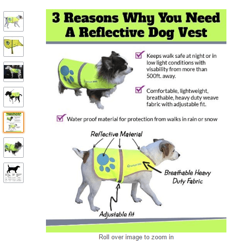
The one image that particularly stands out to me as helpful is the sizing infographic.
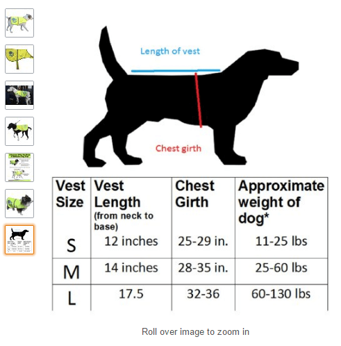
I recently saw a fully completed Splitly test in which a simple and explanatory graphic increased conversion rate by almost 20%. If you consider what one of the main buyer objections would be for a product like a dog vest, it likely relates to the sizing of the vest. Well, a clean explanatory graphic like this shows how these vests are measured, and what size is appropriate based on the dog’s size and weight.
The Twilight Dog owner has this infographic placed at the 7th position, at the bottom of their images. If they placed this graphic higher up, so more people saw it, would it increase conversions? Interesting thought, but must be tested.
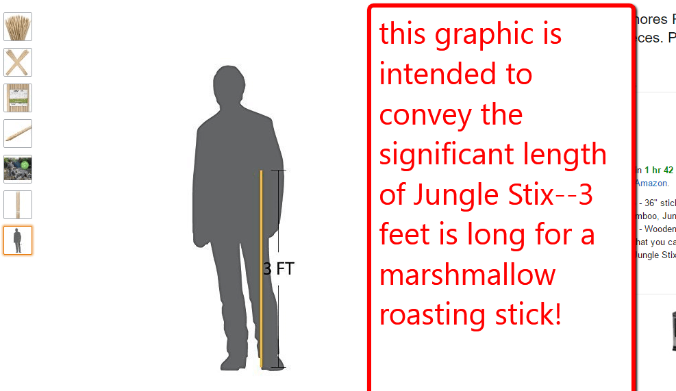
For our Jungle Stix, we wanted to convey the significant length of a 36” marshmallow roasting stick. The cleanest way to do this was using a simple graphic of a person, and showing how high the stick extends up their chest. Again, if you can’t do this on your own, this can be contracted out very easily on Fiverr to help improve your conversion rates.
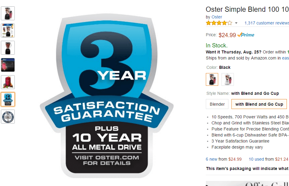
In the product description, they include a 100% Money Back Guarantee for any purchase of a dog vest. We have seen many tests conducted on Splitly that validate the allure of a money back guarantee. However, you can’t necessarily stop at just including it in the Product Description. A simple badge or stamp that visually conveys this guarantee in the product images can help tremendously. As they say, “if you got it, flaunt it!”
This is an example of a product guarantee badge that is included as a product image for an Oster blender:
Key Takeaways:
- Include more than one photo! Even if it’s a simple product, show the product at different angles, include packaging, include close ups, lifestyle shots, explanatory graphics, and whatever else you can think about.
- Make sure your image is at least 1000 pixels on the longest side—the hover-to-zoom is very helpful to customers to get a better sense of your product quality. This converts to more sales!
- Use images to help explain your product to those who don’t make it to the Product Description below. Think of your customers’ biggest objections or questions, and include those as a graphic. Even if it is just a money back guarantee or warrantee, a stock image badge can help ease a buyer’s concerns.
Product Reviews
Product reviews are one aspect of your product listing that is slightly beyond your control. For each product launch that I run (or after suffering from an Out of Stock situation), I will run some promotions to get sales, improve my Best Seller Rank, and generate reviews. I’m sure you know by now that my platform of choice is Review Kick 😉
In addition to the promotional giveaways, I set up automated follow-up email campaigns in Review Kick that go to all sales. This helps me get more reviews from my organic sales as well. And it is a mutually beneficial cycle: as I get more sales, improve my BSR, and get more reviews, my products start generating more organic sales. A nice flywheel effect takes over soon after!
I say this with the assumption that you have a good product that your customers will enjoy. Review Kick won’t help you if you do not sell a high-quality product, because reviewers abide by Amazon Terms of Service and give honest reviews.
(Update October 2016: Due to changes in Amazon’s Terms of Service addressing incentivized reviews, running promotions in return for honest reviews is no longer allowed. Review Kick has now been relaunched as Jump Send, focusing on email communications to help Amazon sellers grow their business. You can still run deals and promotions, which is a great way to increase sales velocity, but we do not allow any form of incentivized review. Find out more about how Jump Send can help you boost you Amazon business in our relaunch blog post.)
Looking at the profile of Customer Reviews from the ankle cuffs, there is not much going on—2 reviews, each five stars.
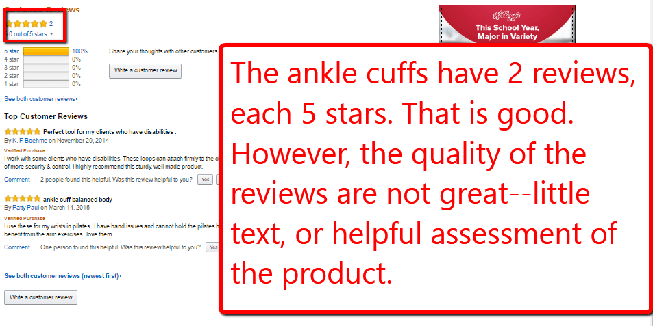
The five star reviews are a good start. But they are from a year and two years ago, so not very recent at all. This seller could benefit from running some promotional campaigns. This would kick start an improvement in the Best Seller Rank, improve social proof by generating more reviews, and likely improve organic sales as a result.
Let’s contrast that with the review profile of Twilight Dog’s reflective vest:
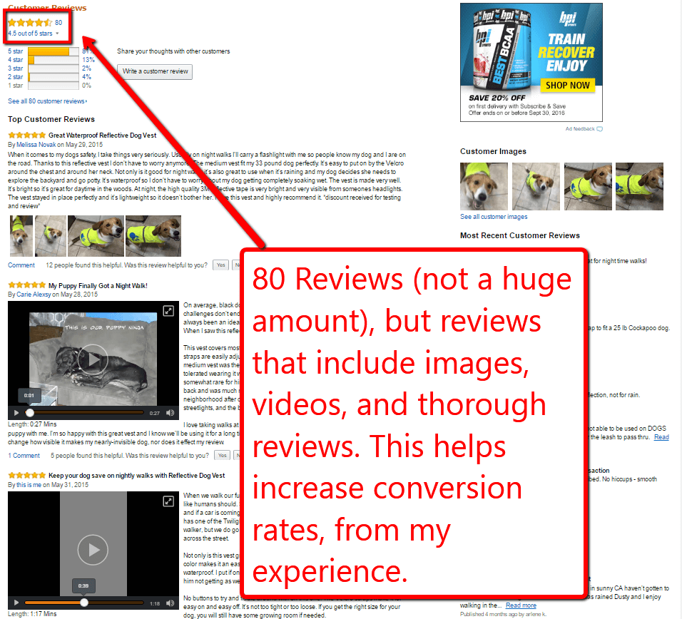
80 reviews is not a huge amount of reviews. However, the nice thing about these reviews is the quality of reviews: photos, videos, descriptive text explaining the user’s whole experience with the product.
How can you get these types of reviews? The best way is to build a relationship with your customer. Obviously, this sounds difficult with such a transactional platform like Amazon. However, the best way that I have found is by writing follow up emails for each person.
It is a quick set up on Review Kick, but the dividends pay off in spades.
My goals with the follow up campaigns are threefold:
- Offer exceptional customer service (beyond what Amazon’s customer support is)
- Highlight the product features that set my product apart
- Ask for, and receive, product reviews
These emails have been instrumental in the number, and quality, of reviews that I have received. Whether you use a manual, or automated, system, I highly recommend following up with your customers to guide them through their post-purchase phase: reinforce the value of the product, some best practices or tips, and once they have experienced the product and ideally gained value from it, ask for a review.
Send emails (automated or manually) to get better product reviews--this will improve conversion… Click To Tweet
Seller Feedback vs. Product Reviews:
A quick note here about Seller Feedback vs. Product Reviews. While you don’t want bad Seller Feedback, getting a good Seller Feedback is only so helpful for anyone using Fulfillment by Amazon. Seller Feedback is more helpful for sellers who use Fulfilled by Merchant, and must prove that they can fulfill orders quickly and without error. Sellers who use the FBA program obviously don’t do their own fulfillment, so any negative Seller Feedback would likely be Amazon’s fault. If you are an FBA seller and have received negative Seller Feedback for something beyond your control, definitely open up a ticket with Amazon support to have it removed.
In Conclusion
And that is my first product listing tear down—hope it was fun and helpful! I think it is always helpful to take a look around the Amazon landscape and observe emerging trends, patterns, and best practices.
Ready to get the analysis applied to your product (or your competitor’s)? You can simply go here to get the breakdown immediately:
GRADE MY PRODUCT LISTING NOW
Now is an ideal time to tighten up your listing before fourth quarter opens up. Let me know if you have any questions in the comments section below, happy to help out however possible!